
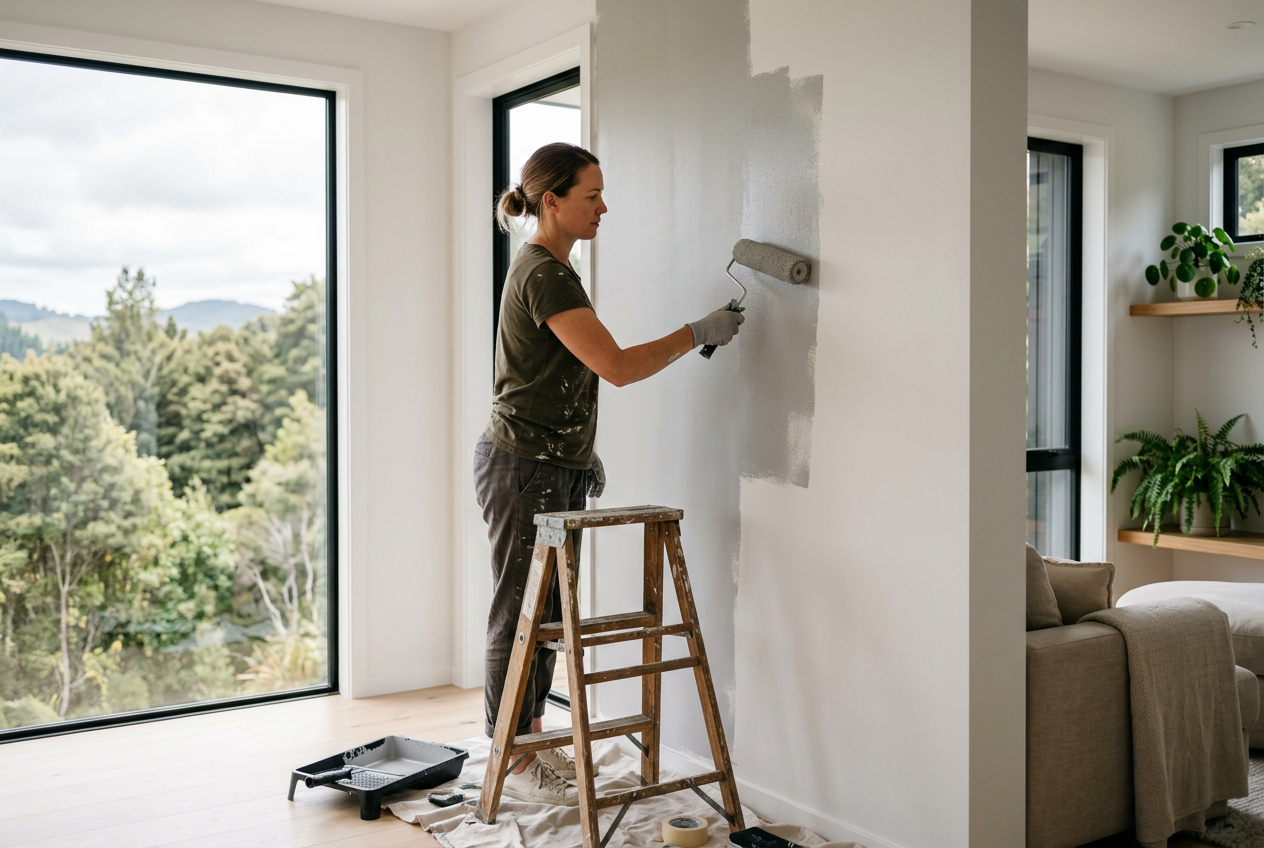
Choosing paint colours for an Australian home is not just about what looks good on a swatch. The direction your room faces can completely change how a colour reads once it is on the wall. In our climate, a north-facing room usually gets stronger, warmer light for much of the day, while a south-facing room tends to receive cooler, softer light. That means the same colour can feel bright and inviting in one room, but dull or icy in another.
If you are planning a repaint, understanding how light works in your space will help you pick a colour that suits the room, the time of day you use it, and the mood you want to create. Whether you are shopping at Bunnings or Mitre 10, checking Dulux, Taubmans or British Paints samples, or coordinating with existing finishes like Gyprock walls, James Hardie linings or Colorbond features, the direction of light should be part of the decision.
Why Room Orientation Changes Colour
Natural light has a major impact on colour temperature. North-facing rooms in Australia generally receive warmer, more consistent sunlight, which can make colours appear brighter, creamier or more saturated. South-facing rooms usually have cooler light and fewer direct sun hours, so colours can look softer, greyer or even slightly blue.
This matters because paint is never seen in isolation. The colour is affected by the light, the size of the room, the flooring, window coverings, furniture and even the colour of the roof or external surrounds. A warm white that feels crisp in a north-facing living room may look yellow in the same home if used in a south-facing bedroom.
Quick Guide to Light Direction
| Room Orientation | Light Quality | Colour Effect | Best Approach |
|---|---|---|---|
| North-facing | Warmer, brighter, more direct light | Colours can look warmer and more intense | Use cooler neutrals or balanced tones to stop the room feeling too hot |
| South-facing | Cooler, softer, less direct light | Colours can appear greyer or darker | Use warmer tones or light-reflective shades to lift the room |
Best Colour Choices for North-Facing Rooms
North-facing rooms often benefit from colours with a cooler or more balanced undertone. Because the light is already warm, these shades can stop the room feeling overly golden or harsh. Think soft greys, cool whites, muted blues, sage greens and clear neutrals that still feel fresh in strong daylight.
If you want a white, avoid testing only in the morning. North-facing rooms may change character during the day, so a white that looks clean early on may feel quite creamy by afternoon. For many Australian homes, a gentle off-white or a cool neutral can be easier to live with than a stark bright white.
For larger open-plan areas, a slightly cooler wall colour can help balance timber floors, tan leather furniture and warm-toned cabinetry. If your home also has strong afternoon sun, consider a finish that is washable but not overly shiny, so the surface does not reflect glare.
Good Options to Sample
- Cool whites with a soft grey or blue undertone
- Light greys that are not too steely
- Muted greens and sage tones
- Pale blues that keep the room feeling airy
- Warm neutrals only if they are tested carefully in the room
Best Colour Choices for South-Facing Rooms
South-facing rooms can feel cooler and dimmer, especially in winter or in homes shaded by trees, neighbouring buildings or verandahs. Warmer paint colours often work well here because they help the room feel more inviting. Creams, warm whites, soft beiges, warm greys, blush tones and earthy neutrals are common choices.
Be careful with colours that are already cool. A grey that looks balanced in a showroom may read flat or chilly on a south-facing wall. Dark colours can still work, but they usually need careful planning so the room does not feel closed in. If you like a moody look, pair a deeper tone with good lighting, reflective finishes and lighter trims.
South-facing rooms are often good candidates for colours with warmth in the undertone rather than strong yellow. This creates a comfortable feel without making the space look dated or too creamy.
Good Options to Sample
- Warm whites and soft creams
- Beiges and oatmeal neutrals
- Greige with a warm base
- Soft terracotta or clay-inspired tones
- Gentle blush or stone shades
How to Test Colours Properly
Paint samples on more than one wall, because light changes across the room. Test a north-facing room in the morning, midday and late afternoon. In a south-facing room, check the colour on a cloudy day as well as in brighter conditions. Sample pots from Dulux, Taubmans or British Paints are useful, but do not rely on the small card alone.
Paint a decent patch on a sheet or directly on the wall and observe it beside flooring, benchtops, curtains and skirting. Also check how it looks with artificial lighting at night. LED downlights, warm globes and dimmers can all shift the final appearance.
If your room has new plasterboard from Gyprock or CSR, make sure the surface has been properly sealed before judging the colour. Bare or patched walls can absorb paint unevenly and alter the result. If you are painting over fibre cement linings from James Hardie or exterior-adjacent interior surfaces, the same rule applies: prep affects finish.
Practical Tips for Better Results
- Choose the colour last, after flooring, window furnishings and large furniture are known.
- Use a matt or low-sheen finish for many walls; it usually hides small imperfections better.
- Keep trims, ceilings and doors in a consistent white for contrast, unless you are going for a fully tonal look.
- Look at the room from the doorway, not only close up, because colour can shift across the space.
- For open-plan homes, choose colours that transition smoothly between north- and south-facing zones.
If your project includes exterior painting or work around eaves, soffits or metal surfaces, products must suit Australian conditions, including heat, UV and coastal exposure where relevant. For Colorbond or other BlueScope steel features, use compatible products and follow the manufacturer’s recommendations. For any electrical work related to new lighting, switches or power points, a licensed electrician must do the job. Plumbing and gas work must also be carried out by the appropriately licensed professional in your state or territory, in line with local Fair Trading or consumer affairs requirements and the National Construction Code.
For safety when sanding, scraping or working at height, follow Safe Work Australia guidance and use appropriate PPE, ladders and ventilation. If you are unsure about lead paint, mould, damp or damaged plaster, get advice before you start.
And if you want more inspiration beyond Australia, you can also browse ideas from Trade Directory NZ.
For a result that suits your light, style and home, find a qualified local painter on Aussie Trade Directory through our local painters.